In this tutorial, I will show you a few ways of creating your own texture library, how to apply and use it in a digital illustration or design with Photoshop.
Texture with the Camera
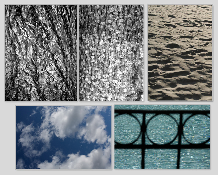
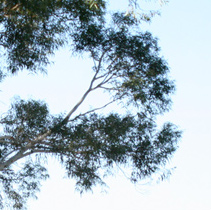
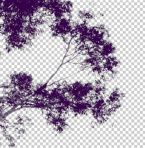
One of the easiest ways to create your own texture library is by photographing everything around you. You never know what you might need. Go on a short walk, there’s texture everywhere! Tree ark in particular have very interesting patterns. Zoom in as close as you can!
Creating Your Own Organic Texture
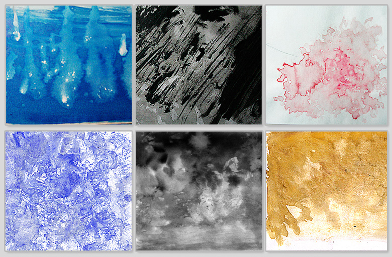
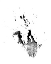
Another good method is to create your own textures by playing around with actual paint. When you create your own textures, you are creating something uniquely you. Paints such as acrylics, gouache, and watercolor can produce some wonderful results. Roll the brush, stab the paper with the brush, sprinkle salt on the watercolor paint. The materials and methods do no matter, it’s how you work with it.
Experiment and have fun!
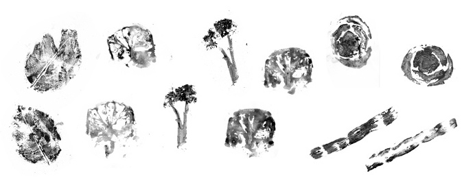
Create texture with organic objects and stamp pad
Look around your fridge or backyard and grab some vegetables, citrus fruit, leaves, and so on. You may have to slice them in half for things such as a green bean or lemon.
Then take a stamp pad, apply ink and press the organic object onto a piece of paper. Now experiment by stamping the object all over the paper, and you can create some very nice texture. In my above example, I used broccoli, lemon, bok choy, a rose leaf, and a green bean. You can also take a paint brush and apply the paint (such as gouache) on the object instead of using a stamp pad.
ATTENTION! Please note this method is very messy and it may be best to use gloves while doing this!
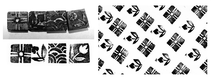
Make a Stamp out of an Eraser
If you feel adventurous, you can take an eraser, a X-acto knife and carve out your very own stamp. This is a very fun way to create patterns. Please be careful and handle the X-acto knife with care!
Creating Texture Digitally
Using Organic Stamps as a Photoshop Brush
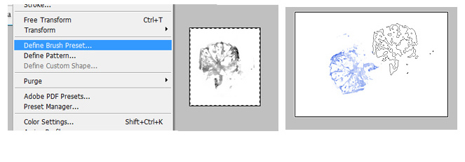
Take a photograph of your organic stamp or scan it. Crop the image and make sure there is nothing else but the stamp.
Go to Edit > Define Brush Present.
The stamp will now appear in your brushes.
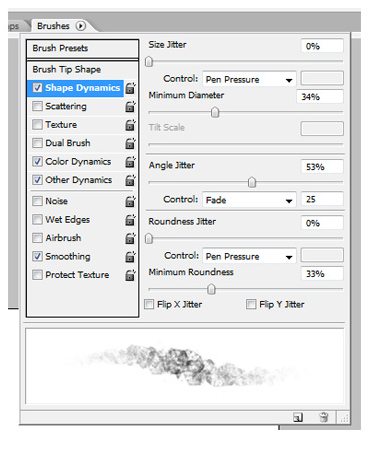
The brush is not yet ready to use because we need to tweak its settings. Go to the Brushes palette (Window > Brushes or F5), and play around with the settings until you are satisfied with it. What works for one brush may not work for another. Again, experiment!
The preview area on the bottom should give you an idea how the brush will turn out with a particular setting.
If you have a tablet, be sure to change the control settings to PEN PRESSURE so the brush will act according to how lightly or hard you press with your pen tablet.
Now give the brush a whirl!
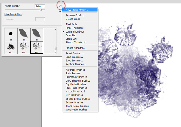
You may have to go to New Brush Present to save your settings.
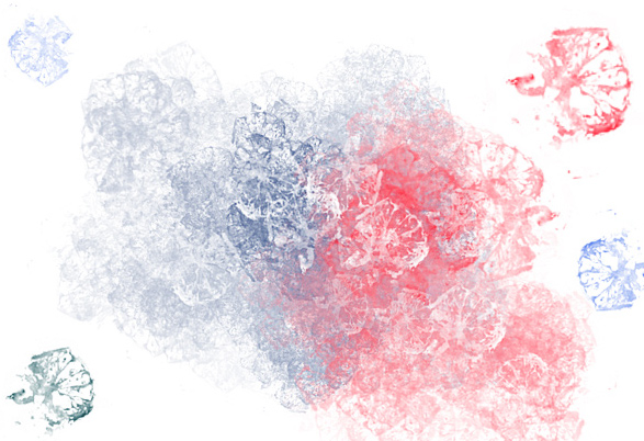
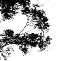
You can create great brushes with seemingly random ink marks, splotches, and blobs.
Photographs can make good brushes though I personally do not use it often. I find it best to desaturate the image and clean up any unnecessary bits you may not want in your brush before hitting Define Brush Present.
Utilizing Your Texture
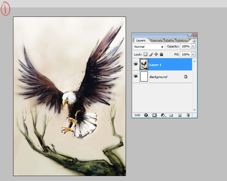
I typically save the texture for last. I usually flatten the image because those texture layers can hog up a lot of memory space and inflate your PSD file size. Not good if you’ve got a slow computer!
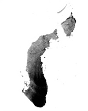
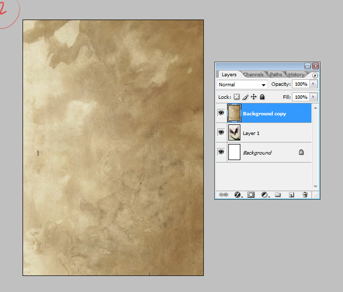
This is the custom texture from my library that I have chosen to use. You have to be mindful of the color of the texture image because it may alter the colors in your illustration.
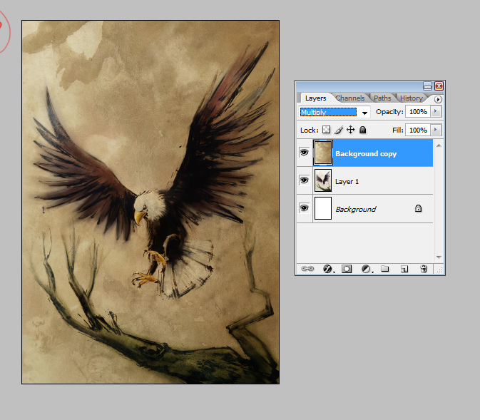
Typically, I just set the texture to OVERLAY, usually with opacity to 20%-50%. However, OVERLAY may not always be best, so be sure to try all the other layer options. For this piece I really liked how it looked on MULTIPLY.
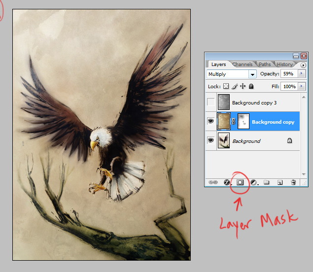
I found the MULTIPLY layer too strong so I adjusted the opacity. I erased parts of the texture but in order to preserve the texture, I needed to use a LAYER MASK.
Using one of my custom texture brushes I lightly erased a few areas here and there. Fyi, LAYER MASKS can also be helpful if you only want texture in one particular area and vice versa.
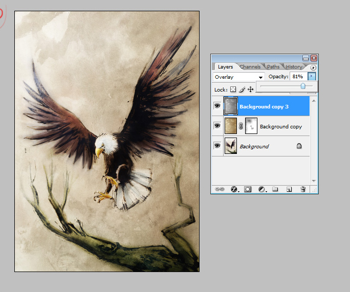
“Background copy 3” is actually the texture duplicated and then desaturated to grayscale. I desaturated it because I wanted more of the texture to pop out without worrying about the colors of my illustration being altered. Then I set it to OVERLAY.
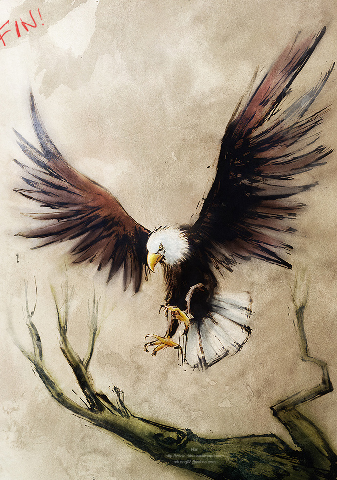
And fin!
As a note, texture can greatly enhance an illustration or design. However, you must not let the texture overwhelm or overpower the piece, otherwise it ends up competing for the viewer’s attention. Let the texture compliment the art! It is also good to create new textures every once in a while to have fresh textures to use.